Input Range Slider
In this article, we will discuss the input[type=” range ”]. The default range input defined by the browser looks very simple, so for frequent use, we need to customize or style the range input which has been used to display numeric data in our project.
The new HTML5 range input gives you a slider component. This is an input where you select a value from a slider with the thumb on it.
The HTML code of the input range slider looks like -
<div class=”wrapper”>
 <input type=”range” min=”0" max=”100" id=”score” />
 <label for=”score”>Exam Score</label>
</div>
The range is one of the new input types introduced in HTML5. This input type allows one to input numbers within the specified range. The browsers will render this input type natively as a slider control. We can slide the handlebar to the right or left to produce the number within the range.
The purpose of an Input Slider has many possibilities like you could use this input for Volume, Audio Player and Rating, etc.
How to Style Input Type Range.
When we first create an HTML for Input Range, the appearance looks like this-

Now we will customize the range input using CSS, according to our specific design. We can apply a direct style to input[type=” range”] but can face cross browsers issues. To overcome this cross-browser issue, we have to use some pseudo-classes, for every browser. There are browser-specific pseudo-elements for range input,so I’m going to cover the following pseudo-elements for chrome, Mozilla, and internet explorer respectively:
First Apply Base Styles
To style Range input, firstly we need to disable the default style on both Thumb and Track using this :
input[type=range]{
     -webkit-appearance: none;
}
input[type=range]::-webkit-slider-thumb {
     -webkit-appearance: none;
}
input[type=range]:focus {
      outline: none;
}
input[type=range]::-ms-track {
      width: 100%;
      cursor: pointer;
      background: transparent;
      border-color: transparent;
      color: transparent;
}
WEBKIT BASED BROWSERS (CHROME, SAFARI)
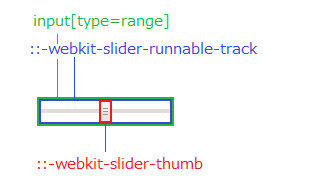
we have to use the special pseudo-selector::webkit-slider-runnable track for the track:: WebKit-slider-thumb for the thumb of Range input for Webkit based browsers.
input[type=range]::-webkit-slider-runnable-track {
    width: 300px;
    height: 5px;
    background: #d2d2d2;
    border: none;
    border-radius: 3px;
}input[type=range]::-webkit-slider-thumb {
    -webkit-appearance: none;
    border: none;
    height: 16px;
    width: 16px;
    border-radius: 50%;
    background: #fff;
    border:1px solid #ddd;
    margin-top: -4px;
}input[type=range]:focus::-webkit-slider-runnable-track {
    background: #008489;
}

FIREFOX
we have to use the special pseudo-selector::-moz-range-track for the track and::-moz-range-thumb for the thumb of Range input for Firefox.
input[type=range]::-moz-range-track {
    width: 300px;
    height: 5px;
    background: #d2d2d2;
    border: none;
    border-radius: 3px;
}input[type=range]::-moz-range-thumb {
    border: none;
    height: 16px;
    width: 16px;
    border-radius: 50%;
    background: #fff;
    border:1px solid #ddd;
    margin-top: -4px;
}input[type=range]:focus::-moz-range-track {
    background: #008489;
}

INTERNET EXPLORER
Input type range supported in IE10+ browser. We have to use::ms-track for the track::ms-thumb for the thumb.
input[type=range]::-ms-track {
    width: 300px;
    height: 5px;
    background: #d2d2d2;
    border: none;
    border-radius: 3px;
}input[type=range]::-ms-thumb {
    border: none;
    height: 16px;
    width: 16px;
    border-radius: 50%;
    background: #fff;
    border:1px solid #ddd;
    margin-top: -4px;
}

How to Style Range Slider Progress Bar?`
Now we will see how to style the HTML5 input slider’s progress which means there would be a difference in color before and after the slide.
For Chrome we used the below CSS for progress bar changes:
@media screen and (-webkit-min-device-pixel-ratio:0) {
 input[type=’range’] {
 overflow: hidden;
 width: 150px;
 -webkit-appearance: none;
 background-color: #ccc;
 }

 input[type=’range’]::-webkit-slider-runnable-track {
 height: 16px;
 -webkit-appearance: none;
 color: #13bba4;
 margin-top: -1px;
 }

 input[type=’range’]::-webkit-slider-thumb {
 width: 10px;
 -webkit-appearance: none;
 height: 16px;
 cursor: pointer;
 background: #434343;
 box-shadow: -80px 0 0 80px #008489;
 }}
Although using this code, we can’t customize the thumb with the help of CSS due to overflow hidden property, so we have to use the image for the thumb in that case.
For Firefox we used the::-moz-range-progress
input[type="range"]::-moz-range-progress {
  background-color: #008489;
}
For Internet Explorer, we used the::-ms-fill-lower and::-ms-fill-upper for progress bar like this:-
input[type="range"]::-ms-fill-lower {
  background-color: #ccc;
}
input[type="range"]::-ms-fill-upper {
  background-color: #008489;
}
Shadow Dom of Range Input
An important aspect of web components is encapsulation — being able to keep the markup structure, style, and behavior hidden and separate from other code on the page so that different parts do not clash, and the code can be kept nice and clean. The Shadow DOM API is a key part of this, providing a way to attach a hidden separated DOM to an element.
Generally, the browsers use DOM/CSS internally to draw them. Basically, the DOM structure is hidden from us, but we can see it in developer tools.
In chrome, we need to enable in Dev Tools “ Show user agent shadow DOM” option.

In Firefox, we need to follow these steps to enable Shadow DOM:
- Go to about:config
- Set
devtools.inspector.showUserAgentShadowRootsto true


Conclusion
The input type range is quite customizable. Unfortunately, each browser has its own way and thus we have to write longer codes than expected. I hope there will be a standard that can regulate this matter in the future. Lastly, here is the link to see the input range we have shown you in this article
